
In this blog post, we’ll take a look at the Facebook Pages of the Fortune 100 and share our Facebook Cover Photo tips. As a business owner, it’s important to keep up with the latest marketing trends. One trend that you can’t ignore is Facebook. Keep reading to learn more.
What is a cover photo on Facebook?
Let’s start with the basics. A cover photo is a large, rectangle image on a Facebook Page or personal profile. The dimensions are 820 x 312 pixels on desktops and 640 x 360 pixels on smartphones. (They don’t make it easy for us.) The profile photo is the smaller circle and the dimensions are 170 x 170.
Note: I haven’t had any trouble with the profile photo getting cropped on desktop vs. mobile, however, there have been some challenges with keeping the cover image looking consistent. Always check your page on your phone.
Related Reading: How to Effectively Market Your Business on Facebook
Facebook Cover Photo Tips from Fortune 100 Companies
#1 – No company is directly selling.
Not a single company in Fortune 100 is using their Facebook Cover Photo to sell. There are no calls to action in this space. It’s used as a space to reinforce the brand.
#2 – Most brands are using a photo.
Admittedly this is a little confusing since it’s called a “Facebook Cover Photo” but a lot of brands will choose to have a graphic or photo with text. A majority have chosen a single photo to feature, usually a brand photo. Here’s an example from John Deere. You can see the signature yellow/green equipment in the background.

#3 – Many brands feature their product or service in their cover image.
My favorite is Caterpillar. Partly because my son loves construction equipment, but also because this is a cool photo. FedEx is another one with a very cool cover image that features their service.


#4 – Evergreen is completely acceptable.
A few companies like Nike and State Farm haven’t updated their cover photo in years. They use their tagline amid the solid background of their brand color. This is something that is timeless, i.e. evergreen. If you’re stressing about getting a new profile photo up every month or every quarter, this is something you can cross off your to-do list. Create something timeless and focus on creating posts instead.


#5 – Words are used sparingly.
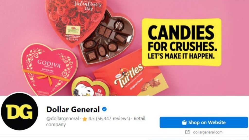
If you choose to use words, keep it short and sweet. The most common way that Fortune 100 companies were using words on their Facebook Cover photos was to tie the image more directly to the brand; to explain its relevance. Here’s an example from Dollar General. The viewer might assume that these candies are available at Dollar General and the copy reinforces that thought.
Conclusion
There are a lot of options when it comes to your Facebook Cover Photo. Looking at what the top brands do can help you feel inspired, generate ideas, and ensure you’re using the platform wisely. The most common practice was to use a high-quality image in line with the company’s aesthetic. Don’t cram too much information into your cover photo – it should be simple and concise. Always experiment with different layouts and designs to see what works best for you.
Join our Facebook Group, The Credible Brand, and share your cover image with the members. We are happy to provide feedback or celebrate your successes.
Receive the latest best practices to your inbox by entering your email address below.